No customer used our theming system. Our rebrand did.
Two years of FactChat's design system, from a mint console to Baze's ink and coral. The colors changed in one place. We're still fixing the hierarchy, one screen at a time.
By Sean Park
TL;DRHardening FactChat for dark mode and per-customer colors looked like overkill once we decided customers wouldn't get the colors. That work let us swap the whole brand for Baze in one place. The hierarchy didn't swap, because color had been doing its job.
In June we built a way for each university on FactChat to recolor the product in its own school color. When I shipped it in September, we decided customers wouldn’t get custom colors after all. The product would have two looks, the brand and dark mode. No customer has ever used it.
By then it had already done its real job. The week before, we’d used it to swap the entire product’s brand.
From mint to blue to a library
The codebase that became Baze started as a console for building chatbots, and it inherited the colors of the console Mindlogic had run since 2023: a mint, #45EC88, on a dark slate. Mindlogic’s own site used the same mint.
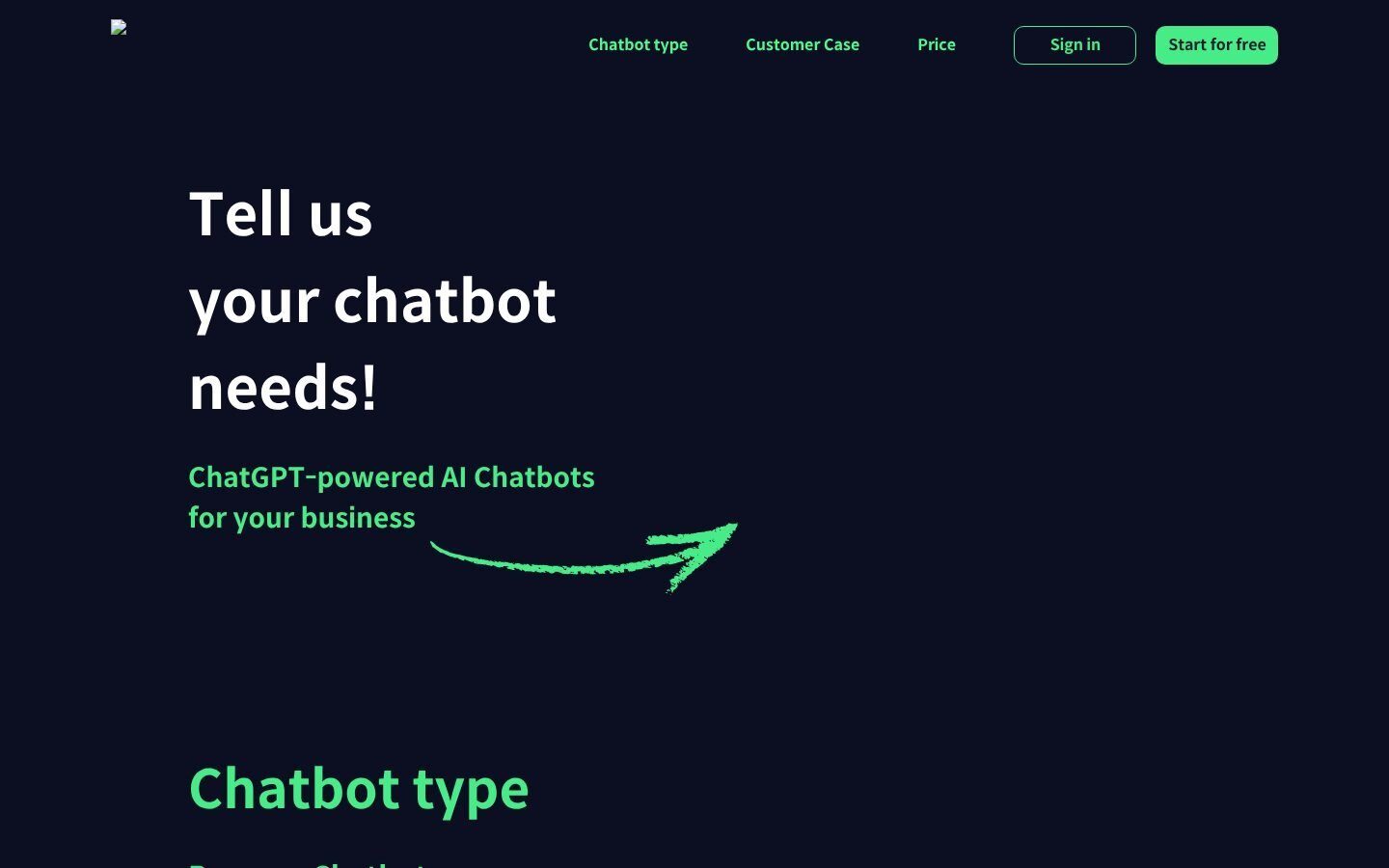
The mint didn’t last. In mid-2024 I reorganized the console’s components the way MongoDB’s LeafyGreen is organized, since I’d worked on that system before. I built that first version almost single-handedly: a 15-step gray, a blue ramp anchored on #1751D0, four corner radii and Pretendard. Other teammates helped out after that. That blue became FactChat’s color when the chat product arrived in January 2025.
In August 2025 we pulled FactChat’s components out into their own library, logician-ui, so other Mindlogic products could use them. Moving FactChat onto it took its component folders from 78 to 18 and deleted 12,892 lines. In December I made a new palette with Claude, the Golden Ratio palette: five hues, including a violet secondary, and a 16-step cool slate, with every pair passing WCAG AA. A teammate built it into the library along with a Chakra UI v3 migration and wrote a migration guide good enough that another engineer moved a second product onto it in four days. At our April retro, the team said FactChat finally felt consistent.

Dark mode and customer colors
Dark mode came in June 2026. It went in as a semantic layer: every color in the library became a role, like a background, a foreground or a border, with a light value and a dark value. We checked it by pixel-diffing all 353 Storybook stories in both modes before FactChat shipped it.
Per-customer colors came straight after. The pitch, at our June retro, was that a university should be able to look like itself. The first version overrode three CSS variables. The version that shipped retints the whole blue scale on the server before the page renders, so every component that uses the primary color changes together and nothing flashes blue first. A resolver at runtime catches hardcoded hex values in d3 maps and canvas drawings. A lint rule bans the raw brand blue, and an allowlist keeps customers to tokens that exist.
That’s a lot of machinery for a feature nobody ended up using. The usual objection is YAGNI, “you aren’t gonna need it.” Martin Fowler, who wrote the standard explanation of it, draws the line where I’d draw it: “Yagni only applies to capabilities built into the software to support a presumptive feature, it does not apply to effort to make the software easier to modify.” Customer colors were the capability. Being able to recolor everything from one place without breaking anything was the second kind of effort. Michael Feathers calls that a seam: “a place where you can alter behavior in your program without editing in that place.” We needed the seam within two months.
Rebranding to Baze
In July Mindlogic decided on a new consumer brand for FactChat, Baze. In August our designer delivered its logo, four rounded diamonds. On August 29 I tried Baze as a tenant skin, using the machinery no customer would get. Two days later I made it the default for the whole app. The palette changed in one place: primary to an azure teal, secondary to mint, a coral accent, neutrals to tan.
Then the screens fell apart. Pages built on the old blue-to-violet ramp lost their structure, because color had been doing the work of hierarchy. Blue had been how a screen said “look here first,” and some of that was mine: the violet secondary came from my Golden Ratio palette. Because the seam made the swap instant, we saw the real cost within days.
We tried coral as the primary color on September 1 and dropped it the same day. It was too close to our error red. My note in the team channel that day was “돌고 돌아 다시 파란색을 primary로,” roughly, “after all that, back to blue for primary.” A mock with no primary color at all looked like grayscale.
The October brand guide settled it and went further than we had in September: warm cream and black only, with no teal, mint or gradients on app screens. Coral comes in two steps: #FF8680 means “do it,” and #DA483E is for large text and the logo. Links are a muted blue, #48607A. Coral still has a contrast problem. A white send arrow on coral is 2.34:1, below the 3:1 that WCAG asks of icons. An ink one, #252525, is 6.55:1. The guide says white, and that’s still an open question.
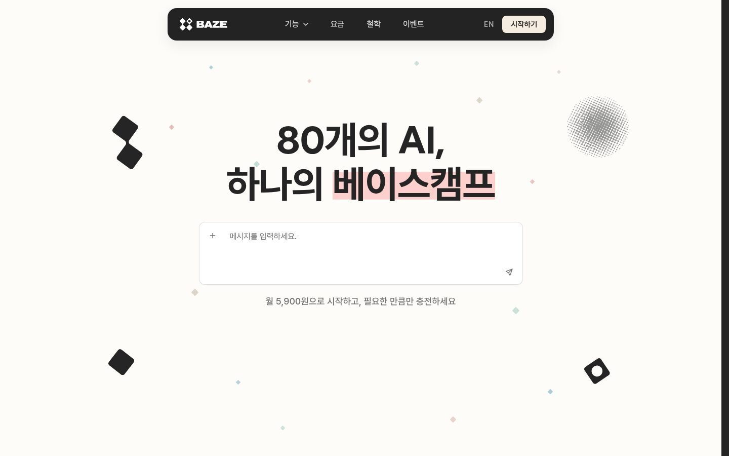
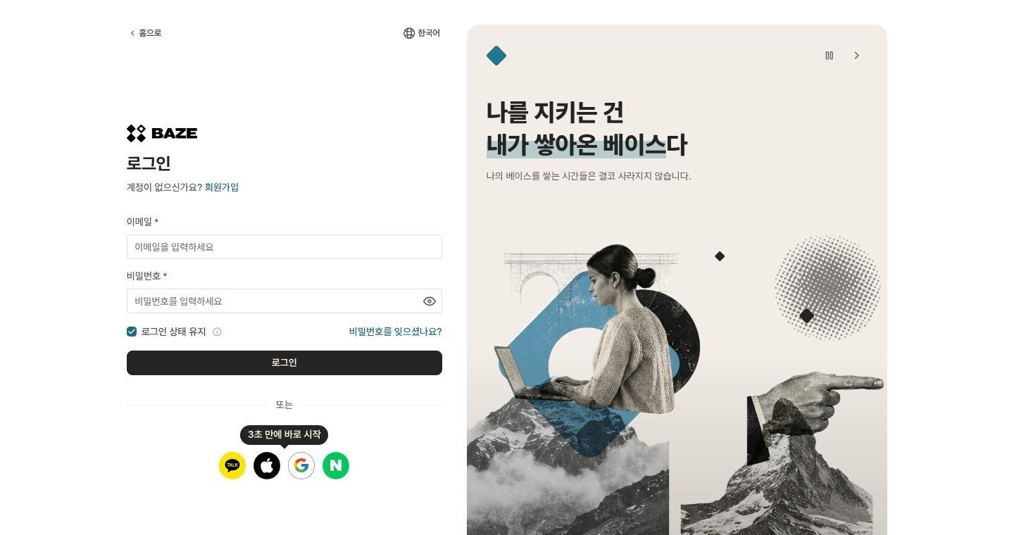
Since late September we’ve been moving the app over screen by screen. We flattened pills, empty states and gradient cards. Thirty-three collage illustrations now fill the places gradients and colored cards used to: the login banner, the plan cards, the credit-purchase coin. Emphasis has to come from size, weight and spacing instead.


What I’d do earlier
Take the color out and look. Set the primary to gray and open your ten most-used screens. If one loses its hierarchy, color is doing a job that size, weight and spacing should do. I found that out in September, after the rebrand had started. A grayscale pass in 2025 would have shown it to us for free, before I gave the system a violet that screens came to depend on.
And build the seam even when the feature is doubtful. Dark mode and customer colors both forced every color through one layer. The rebrand ran through that layer the week before customer colors were cancelled, and that’s why the color swap cost a few pull requests instead of a rewrite.
Where it’s going
The next major version of logician-ui, in alpha now, makes Baze’s palette the foundation of the whole system: warm black, a sandy brown, coral for actions and twelve system hues. A CI test checks contrast on 72 color pairs in four modes. The first preview was too stark, almost black and white, with no way to make one button read as the main action. So the library got a coral accent button, and blue got a single job: links and data.
Mint came back too, a darker one, as September’s secondary. The October guide takes it out again, and production hasn’t caught up yet. The theming system has still had exactly one customer. It was us.
[Sean: thank-yous. Credit the teammates who helped after your first version (Jaewon and Namkyung, if they’re happy to be named; say who did the logician-ui adoption, the Chakra v3 migration and the migration guide), the engineers on the build and release pipeline, and the brand team. Optional fact: since the Claude Sonnet 4 models, Claude Code has probably written all of your design-system commits.]